redesigning the visit planning experience
Over the course of four months, I worked with a team of fellow designers to redesign the visit planning sections of the New York Transit Museum’s website.
Executive summary
-
Problem
How can we address issues with content structure, navigation, and clarity in the visit planning process?
-
Solution
We redesigned key flows across sections that were essential to the visit planning process. We also established a new site map, created an improved content structure within pages, and designed a more streamlined visual layout.
-
Impact
Increased user success rates when navigating to complete key tasks from 56% to 73%.

Background
Who Was Our Client?
The New York Transit Museum’s website is the key touchstone for both new and recurring visitors who are looking to plan a visit and find out more information regarding the Museum.
Existing issues within the website


Highlight time-sensitive information such as current and upcoming exhibits 
Make it easy for visitors to quickly access important informationWe redesigned Key flows across sections that were key to the visit planning process:
home page, exhibit pages, and the plan your visit page.
Our goal was to revitalize the visit planning process within NYTM’s website by focusing on improving the structure of content, proposing a more coherent information architecture, and designing a streamlined visual layout.
How did we get there?
Based on our initial review of the NYTM webiste, our project goal was to ensure that visitors were able complete the process of planning a visit using the Museum’s website, as this could serve as a vital source of foot-traffic and revenue for the Museum. To do so, we decided to visually redesign the visit planning sections of the website, as well as reorganize content to improve navigation and relevancy for potential visitors.
Key Design Questions at this stage:
How might we more effectively convey what exhibitions the Museum has to offer?
How might we create a site map that is more intuitive for visitors looking to plan a visit?
How might we design page content that allows users to more easily navigate and digest information?
Stage 1: Research
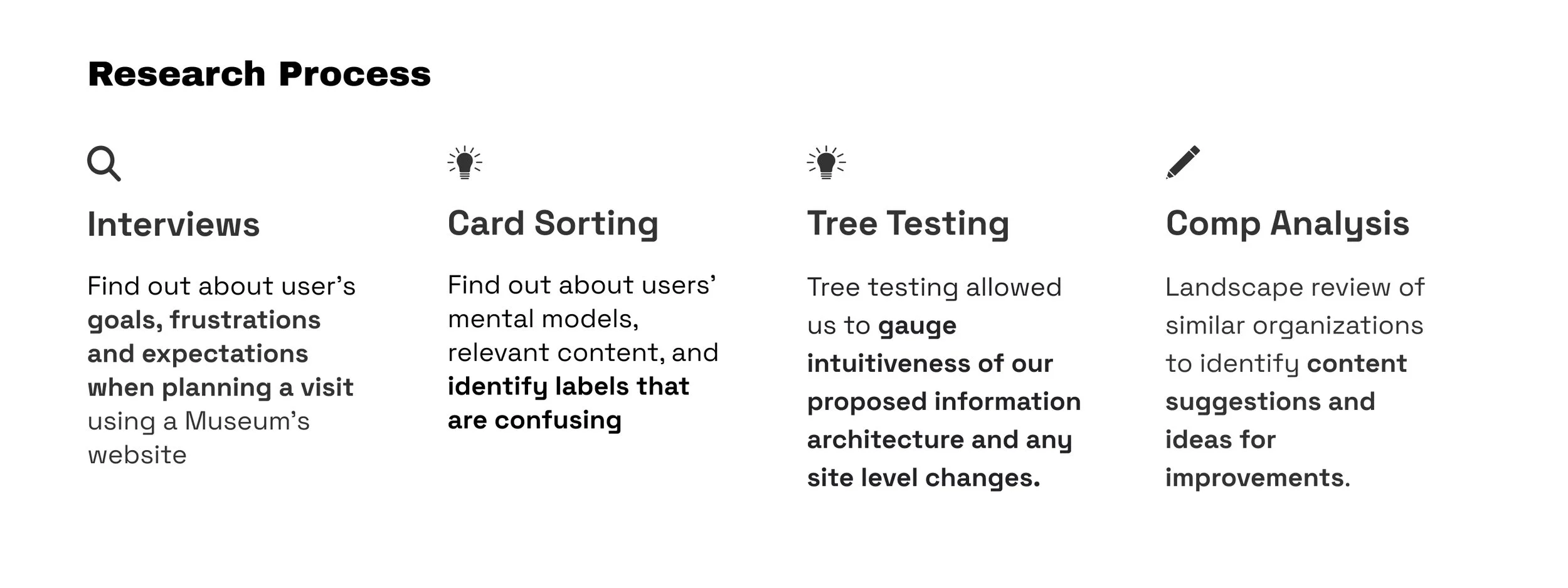
Key Findings
User Interviews
Difficult to Navigate: 3/6 Users complained that they found it difficult to navigate through museum websites, as it often has a lot of content/text/images
Planning Ahead: 4/6 Users said they did not plan ahead before visiting a museum. At the most, users decided 1-2 days in advance.
Scannability: Most users wished to quickly scan through the website, especially to keep up to date with temporary exhibits and events
Not Mobile-Friendly: Most users rarely book tickets through mobile, however many liked to plan visits while on-the-go. We saw this as an area of opportunity to create a mobile experience that was just as easy to navigate and complete as the web version.
Card Sorting
The median number of categories created by participants was 7
14 out of 15 of participants grouped Buy Tickets with Plan your Visit
11 out of 15 participants used the term “Visit” as a heading for grouping Plan your Visit, and Buy Tickets. 8 out of 15 grouped Book a Tour of City Hall station under a Visit heading.
Tree Testing
We conducted a study with 4 participants of 9 tasks. Out of all the tasks completed by participants, 56% ended up at a "correct" destination, 67% of destinations were chosen without backtracking.
Our second iteration showed improvement in participant’s task success rates. We conducted a study with 18 participants and 9 tasks.
Out of all the tasks completed by participants, 73% ended up at the "correct" destination, 64% of destinations were chosen without backtracking.
Competitive analysis
Navigation Bar Can be Optimized: Use Labels that can club different sections like Support & Membership + try reorganizing some content to the footer
Drop-Down Menu with Visuals: Incorporate visuals to make navigating three levels of sub-pages more intuitive
Stage 2: defining design strategy

Stage 3: Design development

01. Revise Information Architecture
02. Wireframes and Lo-Fi Prototypes + User Testing

03. High Fidelity Prototypes
01. Redesigning site map
Final site map consists of a more intuitive and concise content structure, with labels that we found were more familiar to users.

02. Identifying key user flows
Based on the typical user actions when planning a visit – Exploration of exhibitions pages, desire to view any key information needed prior to visiting, we identified the key user flows and subsequent pages that needed to be redesigned.
-
Finding an Exhibit
Home Page > All Exhibits > Specific Exhibit
-
Preparing for visit
Home Page or Specific Exhibit > Plan Your Visit
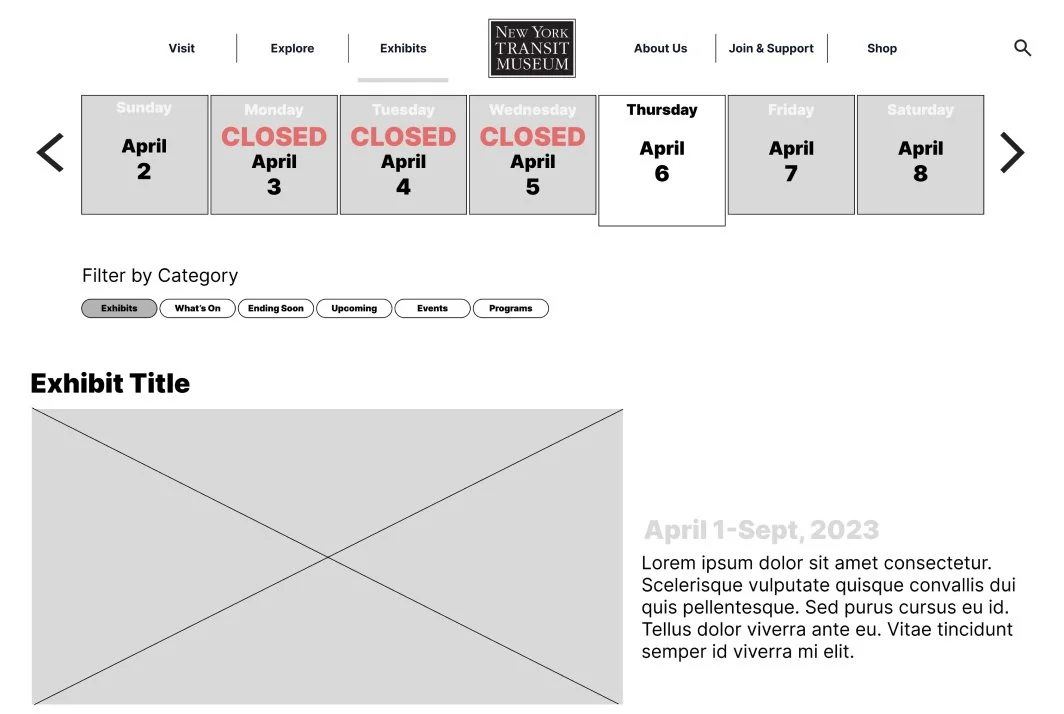
Final Design Screens
Home Page
Strategy and Design decisions taken:
The redesigned Home page focused on the promoting exhibit content to encourage and enable users to easily access a wide range important information, as well as promoting key CTA’s (buying tickets, viewing exhibit information). Our goal for this page was to provide users with enough important information and key actions without overwhelming them.


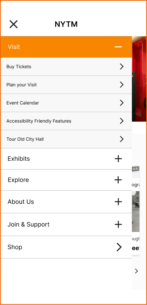
Exhibit Pages
Strategy and Design decisions taken:
The redesigned exhibit pages focused on the promoting both current and upcoming content to encourage and enable users to easily access this important information. Our goal for these pages was to allow users to easily explore the wide variety of current and upcoming exhibitions, as well as encourage users to begin the process of booking a visit through the site.


Moving forward
sucess metrics
We would love the opportunity to apply our designs to the entirety of the website and conduct further user testing.
Observe increased foot-traffic and digitally-booked visits,
A more intuitive and discoverable system should allow users to effectively perform visit planning tasks and increase conversion on this key CTA.