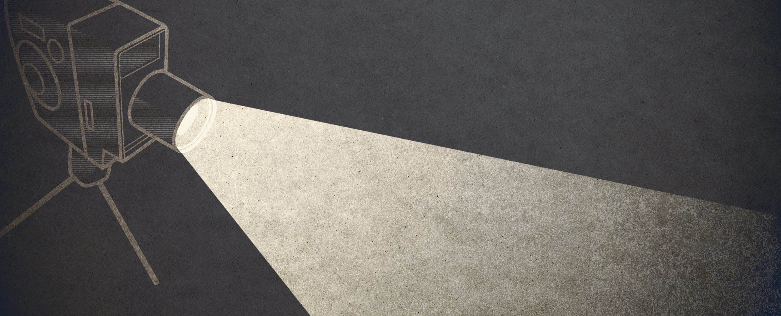
lumiére design system
Over the course of four months, I worked with a team of fellow designers to create and document a Design System for an independent movie theater.
Background
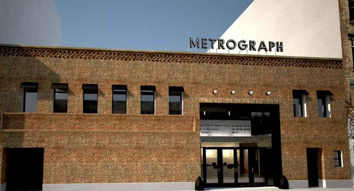
Metrograph is an independent movie theater located in downtown Manhattan that specializes in rare films.
Myself and a team of three fellow designers were interested in working with Metrograph to create a new design system. In order to begin, we first had to conduct an audit of the existing site styles and structure to identify weaknesses, as well as areas of opportunity.
Problem
Why Does metrograph Need a Design System?
visual elements lacked consistency and hierarchy, which led to a disjointed and overwhelming experience.
Key Observations:
Inconsistent CTA components that lacked clear hierarchy and use-cases. For example, the image on the right displays three button styles on a single page, each slightly different. There’s no clear primary button, which makes it difficult to understand the purpose or key call to action of this page.
No clear color scheme for components + instances of certain colors only being used once across the whole website. For example, the green button displayed on this right is the only instance in which this color is used.
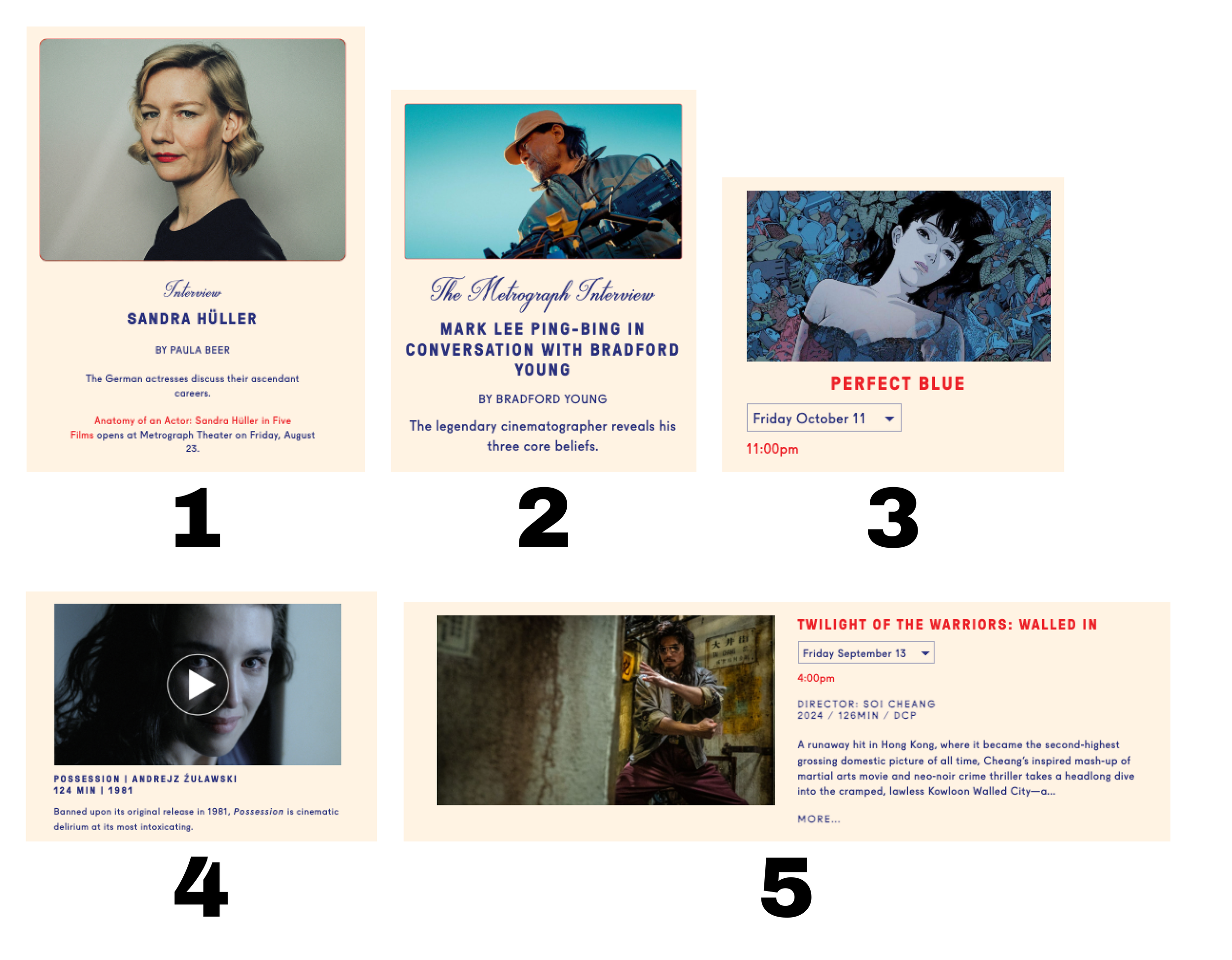
Multiple different designs for components that serve similar functions. We found several different styles of card components, many of which served as linked content but lacked the helpful guidance of CTA buttons.
1
3

2
Process
-
Discover 🔎
Compile a visual document all of Metrograph’s current UI elements to understand the systems’ scope
Perform an accessibility audit based on current WCAG guidelines to address key areas for improvement
-
Define 💡
Define our project’s focus based on what we found lacking within the current system
Identify and reflect Metrograph’s unique visual identity through our system’s branding
-
Design & Document ✏️
Create a UI Kit that focuses on efficiency, hierarchy, and clarity.
Establish documentation for our system that can be used cross-functionally
Discover
Colors, Text Styles, and Headings, Oh My!
We performed an audit and created a visual document of all of Metrograph’s UI elements.
By doing so, we were able to determinie which elements and components needed to be changed, paired down, or kept as is.

Key Findings
-
1
CTA’s lack clear hierarchy
↓
Button styles need to be pared down
-
2
Color usage is inconsistent
↓
Establish a more concise scheme
-
3
Overuse of text styles & fonts
↓
Create more clear & concise styles
Define
We’re Ready for Our Close-Up
In order to establish the branding for our system, we identified key aspects of the Theater’s brand and identity:
🎬 For movie lovers
🎞️ Curated
📽️ Inspired by vintage cinema
🎭 Creative community
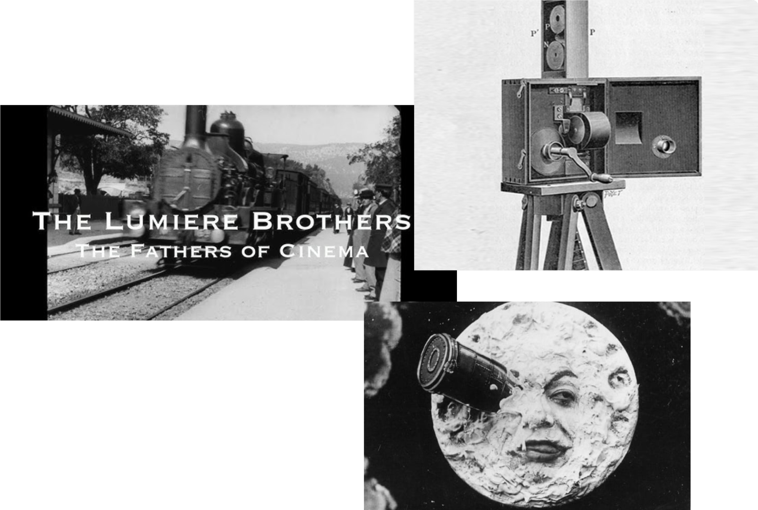
Lumiére 🌑
Lumiére is a reference to cinematography’s innovative beginnings, and reflects Metrograph’s role as a theater that preserves this rich history. The name comes from The Lumiére Brothers, who are considered pioneers of Cinema. Lumiére is also the French word for “Light.”
Our Focus + goals for improvement
-
Efficiency 🎯
Our solution focused on the fact that Metrograph is a relatively small website, and therefore it requires a system that focuses on quality and efficiency of components, as opposed to quantity.
-
Clarity ✨
Our goal was to improve the clarity by identifying specific use cases for each element, and pairing down the existing color and typography schemes to avoid excess elements with no clear use.
-
Hierarchy 🪜
We focused on creating a clear distinction of primary, secondary, and tertiary elements, as well as text styles to ensure that each element’s purpose and place within a design were clear.
Design
Here’s Looking at You, Kit
We began our design phase on a whiteboard by organizing and naming our primitive elements and tokens.
Drafting this by hand allowed us to think critically about what our system actually needed, and what naming structure worked best before getting sidetracked by any specific design-based choices (color, radius, font, etc).
Once we established the token naming structure on paper, we moved this structure to our Figma local variables as our primitive and token variables.

Components & Sections Challenge
Metrograph used 5 different card styles for linked content like movie ticket bookings—all lacking clear CTAs.
The inconsistent card designs and hidden actions had the potential to create several issues:
Users might struggle to identify clickable elements, leading to missed conversion opportunities for ticket sales and memberships.
Multiple card variations can lead to increased design complexity and development time.
Inconsistent patterns made the interface less intuitive and harder to follow.
Components & Sections soltuion
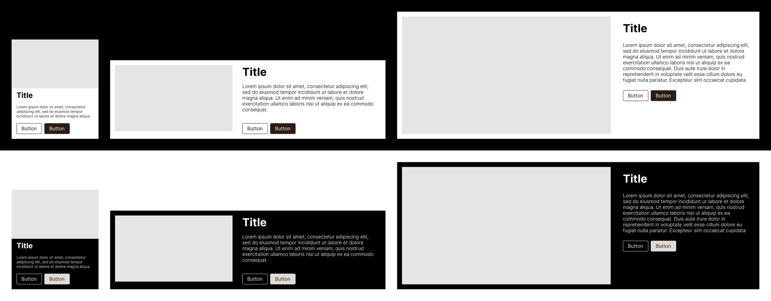
I identified an opportunity to consolidate cards into three adaptable components.
Organized by size (small, medium, and large), and with prominent CTAs. This simplified the design system while improving usability and adaptability:
Boolean properties enable designers to toggle between one, two, or no buttons depending on content.
Media Type properties allow component to adapt to the type of content (video or image) frequently used within the website
Variable mode tokens for light and dark mode allow for easy customization
Colors & Buttons Challenge
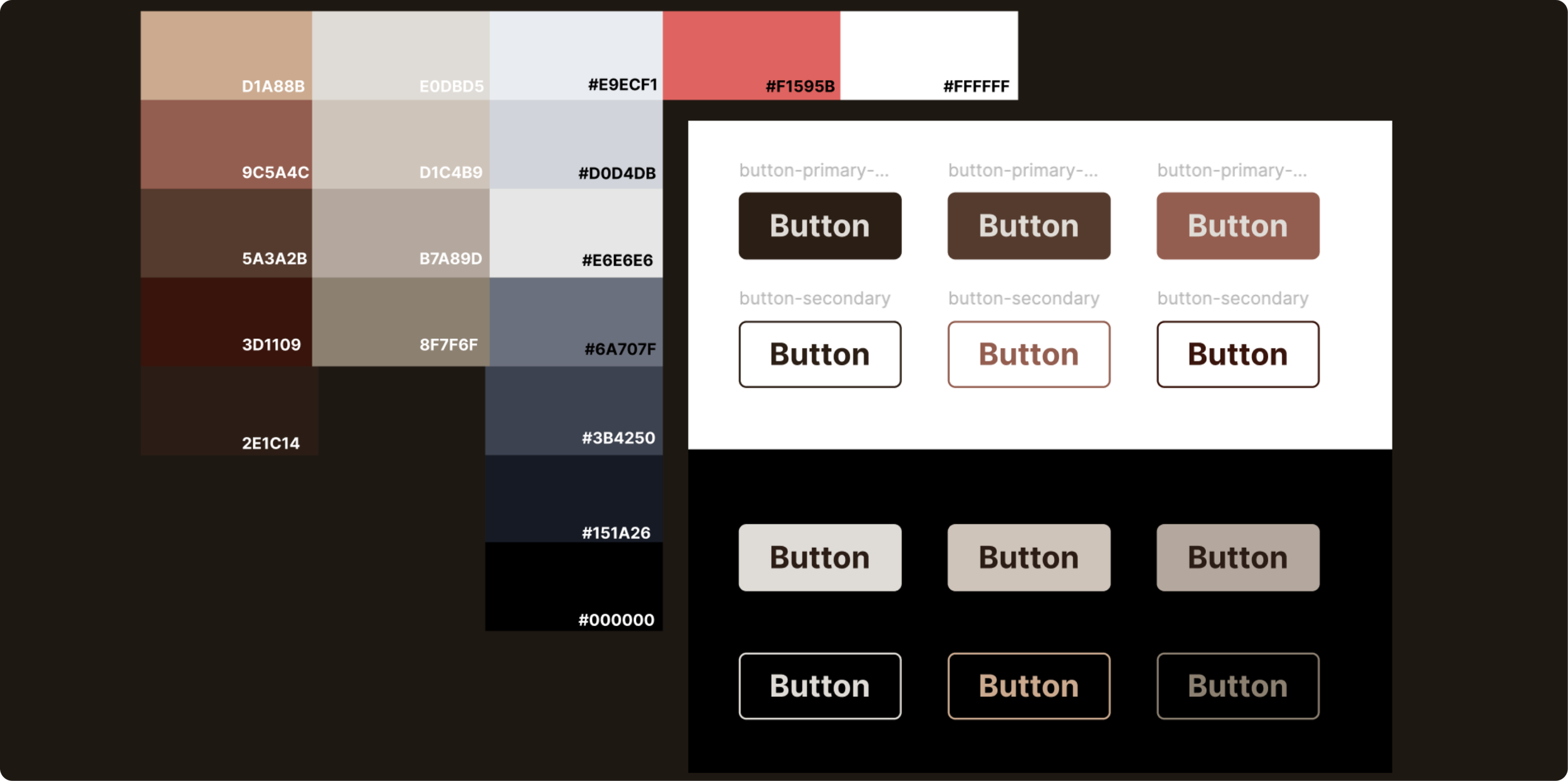
Our audit revealed 10+ button styles across the site—far more than necessary for clear user actions.
The original colors also competed with film content and posed challenges for dark mode adaptation

Colors & Buttons Solution
I streamlined buttons into three core styles.
Primary, secondary, tertiary, which covered all interaction needs while effectively paring down the amount of styles in use.
For the visual design, I developed a brown/beige color palette with semi-rounded corners that:
Complemented rather than competed with Metrograph's vibrant film content
Balanced the theater's vintage heritage with modern usability principles
Created clear visual hierarchy for user actions
Maintained visibility and accessibility across both light/dark modes
This deliberate shift from high-contrast colors to neutral tones improved both the system's adaptability and the overall viewing experience of Metrograph's film content.
Houston, We Have a UX Problem
Working with fellow designers, we ran tests to gain a better understanding of how well our system worked.
This also helped to identify what we needed to change in order to ensure that Lumiére upheld our goals of establishing clarity, efficiency, and hierarchy in the design process.
-
what worked
✅ Designers found it easy to locate components
✅ Designers appreciated the detailed labeling of components
✅ Designers were able to easily understand and use our established hierarchy for tokens and text styles.
-
what didnt work
🚨 Spacing guidelines between elements on a page were unclear
🚨 Card components were missing a property to match larger homepage posts
🚨 Text styles were missing a “regular” font property.
Document
We’re Gonna Need a Bigger Guidebook
We implemented the findings from our testing, and created documentation to serve as guidelines and onboarding for future users.
We created our documentation with designers and developers in mind, our goal was to create a document that could be used across product teams as a formative and comprehensive guide.

͢
Moving FOrward
That’s all folks!
Lumiére lacks developer input, which is essential to the system's success. Extensive testing and collaboration with developers, product managers, and product-adjacent teams are needed to ensure that Lumiére can be successfully used cross-functionally.
I really appreciated the process of working on this project. It was a great exercise in close collaboration and iteration with fellow designers.
As with all design projects, I would love the opportunity to build upon this and test it further. I think it would be especially useful to be able to work with developers, product, and project managers to test this system and obtain a more tangible and comprehensive measure of success.